Excel Centigrade and Fahrenheit Chart
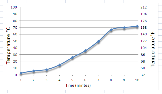
Microsoft Excel does not have a feature that allows a chart based upon a single set of data with multiple scales on the axis, the common use for this is generating a temperature chart with both Centigrade and Fahrenheit temperature scales (as show by the example below). There is a work around method to produce this type of chart with both Centigrade and Fahrenheit scales and this guide will demonstrate how to create the chart in Excel (2003, 2007 and 2010). This method can also be employed to make charts using the Kelvin temperature scale.
The process to create the Excel Centigrade and Fahrenheit chart can be summarised into:
- Constructed a primary chart with the original data (either in Centigrade, Fahrenheit or Kelvin).
- Add a second set of data to the chart that is well out side of the required temperature range.
- Spilt the chart to have two axis (primary for main data and secondary for the irrelevant data).
- Adjust the primary axis to cover primary temperature range
- Align secondary axis with secondary temperature range, this will also hide the irrelevant data from the second stage.
Tutorial - Excel Centigrade and Fahrenheit Chart
This example will create a temperature chart based on the data below, the chart will have two separate axis scales; the primary axis in Centigrade with the secondary in Fahrenheit. The final chart will resemble the excel chart in the introduction.

The first stage is to construct the primary chart based on the temperature and data for the x axis (in the example above time in minutes). For those able to construct charts please skip to Page 2.
Stage 1 - The Primary Temperature Chart

On the insert tab click on the scatter icon and this will insert a blank chart.

Rick click on the blank chart and click on "select data" to bring up the Select Data Source window.

Click the Add button to add a new series to the blank chart.

Click on the Series X Values icon (as show above) to select the data for the x (horizontal) axis.

Use the Edit series window to highlight the relevant data, in our example the Time column is highlighted. click on the right button on the box to return to the Edit Series window.

Repeat the process for the y (vertical) data by clicking on the Y Series Values button.

In our example the temperature is reported in Centigrade (C) but this could easily be Fahrenheit (F) or Kelvin (K). Once the data is selected click on the right button and then the OK on the Select Data Source Window - This will construct a very bland temperature chart with only the primary temperature scale.

Related Pages and Random Possibly Useful Guides
Reduce Mouse Clicks, Save Fingers!
Excel Guides -
%RSD -
Random number -
Bullet Points -
Adding Line Space -
Weather Chart -
Joining scatter Points -
Centigrade and Fahrenheit Charts -
Adding Units to a Function -
Add units to a Cell -
Loan Amount
Cat Guides -
Is a second cat a good idea? -
Why Two cats
CV Guides -
The Personal Statement
Car Guide -
Replace Disk brakes on a Peugeot 307
Visual Marketing
How important are visual images for my business?
Using a web application for creating images
How to use Stencil for marketing campaigns.
How to resize an image
How to add words and text to an image
How to create images for online advertising
How do I create images with quotes?
Photoshop -
Black and white images -
Gausium Boarder -
Home Page
Word -
Format Tables easily -
Add tick symbol